High Contrast Color Palettes & Bold Contrast Colors

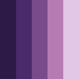
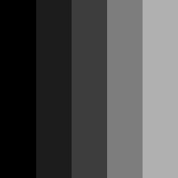
Explore eye-catching high contrast color palettes designed to stand out. Use our AI-powered high contrast color palette generator to create beautiful contrast color combinations for dynamic branding, modern web design, and creative projects.

Discover the power of contrast through high contrast color palettes generated by our color palette generator. These palettes combine dark tones with bright accents - like green sage, golden yellow, turquoise, and more - to create designs that improve visibility and accessibility.

Key Characteristics of High Contrast Color Palettes:

  • Strong contrast between light and dark colors

  • Vibrant accents against deep backgrounds (e.g. golden yellow, turquoise)

  • Improve legibility, visual hierarchy, and modern aesthetics.

Featured High Contrast Color Palette of the Month

Subspace blends deep purples with soft lilac tones. It balances femininity and elegance with strong visual impact. It’s ideal for futuristic, moody, psychedelic or cyberpunk-inspired designs.

🎨 Colors: 

  • Valhalla #2E1A47

  • Jacarta #4A2A6A

  • Affair #794B8B

  • Bouquet #B77BB4

  • Snuff #E2C7E6

❤️ Saved by 90+ designers this month!

Most Loved High Contrast Color Palettes by Our Users

Black Knight - This minimalist color palette features deep black and greys, perfect for luxury branding, masculine themes, and premium UIs to convey strength, sophistication, and a modern grayscale look.

  • Black #000000

  • Cod Gray #1C1C1C

  • Mine Shaft #3D3D3D

  • Boulder #7D7D7D

  • Silver Chalice #B0B0B0

Paranoid - This elegant high contrast palette has rich purples and dreamy lavenders. It's great for psychedelic, cyberpunk, and 1980s designs.

  • Port Gore #1D1D4E

  • Victoria #3F3F88

  • Blue Violet #5F5FBF

  • Dull Lavender #9A9AE0

  • Moon Raker #D2D2F4

Diamond - This beautiful high contrast color palette features cool blue tones and is perfect for luxury web design and minimalist branding. 

  • Spindle #B9DAE9

  • Pigeon Post #A5C5D5

  • Bali Hai #7CA2B1

  • Smalt Blue #4F7F8C

  • Casal #2D5B67

About High Contrast Colors

Color Psychology of Contrast:

High contrast colors enhance clarity and grab attention. They create visual hierarchy and are essential for accessibility.

Here are a few examples:

  • Black + White = authority, simplicity and clarity 

  • Yellow + Navy = energy with elegance and sophistication 

  • Purple + Lime = edgy and youthful contrast

Trends & History:

High contrast color combinations have been used for decades in advertising, signage, wayfinding, and editorial layouts.

Contrast colors are a powerful design tool for 1980s retro graphics, psychedelic designs, dark-mode UIs, and minimalist branding.

Where to Use High Contrast Color Palettes:

Use high contrast color combinations for maximal effect in: 

  • Web and app UI design

  • Branding and packaging

  • Fashion and editorial design

  • Signage, posters, ads, and social media

  • 1980s, cyberpunk, and psychedelic design styles.

What Are High Contrast Colors?

High contrast colors are shades that sit far apart on the color wheel or differ greatly in brightness. 

Some examples of high-contrast color combinations include:

  • Black + Golden Yellow

  • Charcoal + Electric Turquoise

  • Navy + Bright Sage Green

  • Purple + Lime

  • Pastel Pink + Forest Green.

What Color Contrasts with Yellow? 

Yellow contrasts best with:

  • Navy Blue 

  • Charcoal

  • Black 

  • Rich Purple 

  • Forest Green

What Color Contrasts with Blue?

Blue contrasts best with:

  • Warm Orange

  • Golden Yellow

  • Burgundy

  • Red

  • Sage

  • Lime Green

  • Charcoal

  • Pale Neutrals.

Download High Contrast Color Palette (PNG)

Download our editor’s pick high contrast color palette that features beautiful contrast colors.

Download high contrast color palette PNG image (landscape)
Download high contrast color palette PNG image (square)