Natural Wood Color Palettes: Mahogany, Pine, Oak & More

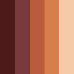
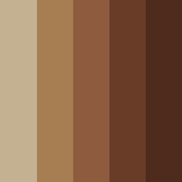
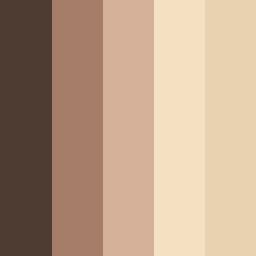
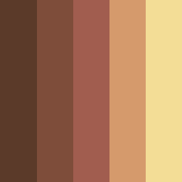
Explore the natural beauty of wood color palettes that bring warmth, authenticity, and organic elegance to any design project.

From rich mahogany wood color palettes and rustic pine wood combinations to traditional oak wood color schemes and elegant beech wood variations -  each palette includes precise HEX codes, making it easy to use in your designs. 

Use our color palette generator to create your own color combination with wood for eco-conscious branding, interior design, and creative applications.

Featured Wood Color Palette of the Month

โœจ Burning Forest - This dramatic natural wood color palette features a progression from deep cedar to soft cream. It works well for autumn themes and rustic hospitality branding.

๐ŸŽจ Colors: 

  • Cedar - #4D1919

  • Lotus - #783A3A

  • Brown Rust - #B95B3C:

  • Raw Sienna - #D67F4C

  • Maize - #F4CAA9

โค๏ธ Saved by 90 designers this month!

Most Loved Wood Color Palettes by Our Users

Oak Wood Color Palette - This classic wooden scheme shows a rich progression from light oak to deep brown tones.

  • Indian Khaki - #C3B192

  • Limed Oak - #A77D52

  • Potters Clay - #8E5B3E

  • Irish Coffee - #683C27

  • Metallic Bronze - #4E2B1D

Contrasting Woods - This sophisticated natural wood color palette combines different wood tones together - walnut, sandalwood, and light wood colors.

  • Mondo - #4E3B31

  • Sandal - #A57D69

  • Cameo - #D6B19A

  • Sidecar - #F5E0C2

  • Raffia - #E8D2B0

Mahogany Sunset - This luxurious mahogany wood color palette offers rich hardwood variations with golden accents.

  • Quincy - #5B3A29

  • Ironstone - #7E4D3A

  • Matrix - #A15D4F

  • Whiskey - #D59A6C

  • New Orleans - #F3DD96

๐ŸŒณ Wood Colors (with HEX Codes)

Wood colors encompass a sophisticated range of hues that capture the natural beauty of hardwood and softwood tones.

Light Wood Colors:

  • Birch - #F5F5DC: A pale, almost-white wood with subtle warmth

  • Pine - #E8D5B7: A light wood color with golden undertones

  • Maple - #D2B48C: A warm, medium-light tone

  • Ash - #C0C0C0: A gray-toned light wood with cool undertones

Medium Wood Colors:

  • Oak - #D2691E: The classic natural wood color

  • Cherry - #DE3163: A rich, reddish wood tone

  • Teak - #B8860B: A golden-brown exotic wood

  • Beech - #F5F5DC: A pale, neutral wood tone

Dark Wood Colors:

  • Walnut - #8B4513: A rich, chocolate-brown

  • Mahogany - #C04000: A reddish-brown 

  • Ebony - #2F2F2F: A nearly-black wood

  • Rosewood - #65000B: A deep, dark red-brown.

๐Ÿ’ก Psychology of Wood Colors in Design

Understanding how wood color palettes make people feel helps you create designs that truly connect with your audience:

  • Natural Authenticity: Create immediate associations with organic materials, craftsmanship, and environmental consciousness

  • Warmth & Comfort: Trigger psychological feelings of home, security, and comfort

  • Stability & Reliability: Express stability and long-lasting value

  • Luxury & Craftsmanship: Suggest high-end craftsmanship and attention to detail

  • Connection to Nature: Help bridge indoor and outdoor environments.

๐ŸŽจ Popular Color Combinations with Wood

  • White and Wood: A timeless pairing that brings warmth without being too much, with clean contrast

  • Forest Green and Wood: Organic, nature-inspired combinations

  • Blue and Wood: Coastal, relaxed aesthetics

  • Gray and Wood: Modern neutrals balance wood's warmth

  • Cream and Wood: Elegant, timeless combinations

  • Black and Wood: A dramatic combination that maximizes contrast while maintaining organic warmth.

โ™ฟ Accessibility Considerations

When implementing wood color palettes in digital design, accessibility should be a priority. 

Light wood color palettes typically require darker text for optimal readability, while dark wood color schemes can support light text. 

Always test contrast ratios with accessibility tools like our contrast checker to comply with WCAG guidelines.

Best Practices - High Contrast Accents 

For better accessibility, use high contrast neutral accents in your wood color schemes to support users with various visual needs.