Vibrant Color Palettes & Bold Color Schemes

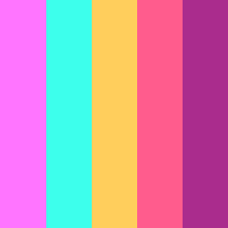
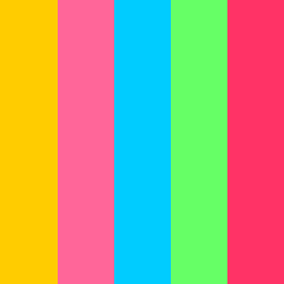
Explore bold, intense vibrant color palettes that feature high-saturation hues and bring energy to any design project. 

From bold royal blues and neon greens to vibrant tropical color combinations - each palette includes precise HEX codes, making it easy to use in your designs.

Vibrant color schemes create a dynamic, energetic feel, perfect for youth and fitness brands, tech companies, entertainment platforms, and any project that needs to to make a bold statement and capture attention.

Use our vibrant color palette generator to create bold color combinations for your design projects.

Featured Vibrant Color Palette of the Month

โœจ 80's Alien - This bold and vibrant color palette features bright blues, hot pinks, and neon greens, capturing the electric energy of the 80s. Perfect for retro-futuristic designs.

๐ŸŽจ Colors: 

  • Dodger Blue - #4D6AFF

  • Heliotrope - #9A5CFF

  • Hot Pink - #FF57B9

  • Kournikova - #FFEC70

  • Spring Green - #00FF9D

โค๏ธ Saved by 200+ designers this month!

Most Loved Vibrant Color Palettes by Our Users

Vaporwave - This extremely vibrant color palette brings together hot pink, cyan, orange, and purple - perfect for  high-energy designs.

  • Blush Pink - #FF75FF

  • Cyan / Aqua - #3DFFEC

  • Golden Tainoi - #FFCE5C

  • Wild Watermelon - #FF5C8D

  • Medium Red Violet - #AA2C8D

Pac-man - This bold, energetic color palette combines vibrant colors like bright yellow, hot pink, electric blue, lime green, and red.

  • Supernova - #FFCC00

  • Hot Pink - #FF6699

  • Cyan / Aqua - #00CCFF

  • Screamin' Green - #66FF66

  • Radical Red - #FF3366

Ayato - This vibrant tropical color palette combines ocean blues with coral accents, creating an energetic yet balanced feel.

  • Calypso - #3B7E9B

  • Tradewind - #5CB2AF

  • Bermuda - #7DD8C3

  • Corvette - #FBD7A7

  • Froly - #F76E6E

๐Ÿ‘‰ Explore our related collections: bright color palettes, color schemes with royal blue, and tropical color palettes for additional high-energy inspiration.

๐ŸŒˆ What Are Vibrant Colors 

Vibrant colors are high-saturation hues that appear bright, intense, and energetic. They capture attention immediately and create strong emotional responses.

Key Characteristics of Vibrant Colors:

  • High saturation: Pure, intense colors without dullness

  • Electric energy: Commands immediate attention

  • Bold contrast: Creates dynamic visual impact

  • Emotional stimulation: Evokes energy, creativity, optimism

  • Visual impact: Perfect for creating memorable brand experiences

๐ŸŒŸ Primary Vibrant Colors (with HEX Codes)

  • ๐Ÿ’™ Vibrant Blues: Electric Blue (#0080FF), Vibrant Royal Blue (#4169E1), Neon Blue (#1B03A3), Cyan (#00FFFF)

  • ๐Ÿ’š Vibrant Greens: Vibrant Mint Green (#00FF7F), Electric Green (#00FF00), Vibrant Forest Green (#228B22), Lime Green (#32CD32)

  • ๐Ÿฉท Electric Pinks: Hot Pink (#FF69B4), Magenta (#FF00FF), Electric Pink (#F535AA), Fuchsia (#FF00FF)

  • ๐Ÿ’› Bright Yellows: Vibrant Yellow (#FFFF00), Electric Yellow (#FFFF33), Neon Yellow (#DFFF00), Gold (#FFD700)

๐ŸŒŸ All Vibrant Colors (with HEX Codes) 

  • Electric Blue: #0080FF

  • Hot Pink: #FF69B4

  • Lime Green: #32CD32

  • Bright Orange: #FF4500

  • Purple: #8000FF

  • Cyan: #00FFFF

  • Magenta: #FF00FF

  • Yellow: #FFFF00

  • Red: #FF0000

  • Spring Green: #00FF7F

๐Ÿ”ฅ More Vibrant Color Schemes for Your Designs

Vibrant Royal Blue Color Combination:

  • Vibrant Royal Blue - #4169E1

  • Electric Cyan - #00FFFF

  • Bright Navy - #191970

  • Sky Blue - #87CEEB

  • Steel Blue - #4682B4

Vibrant Sage Green and Coral Palette:

  • Vibrant Sage Green - #87D3A0

  • Electric Coral - #FF6B6B

  • Mint Green - #98FB98

  • Peach - #FFCBA4

  • Cream - #FFFDD0

Vibrant Autumn Palette:

  • Burnt Orange - #FF4500

  • Golden Yellow - #FFD700

  • Crimson Red - #DC143C

  • Forest Green - #228B22

  • Purple - #800080

โ™ฟ Accessibility Considerations & Tips

Vibrant colors require careful consideration for accessibility due to their high intensity. 

When using vibrant color palettes in your designs, ensure sufficient contrast ratios for text readability. 

Avoid using vibrant colors as primary text colors on light backgrounds. Consider providing alternative color options for users with photosensitivity.

Always test contrast ratios with accessibility tools like our contrast checker to meet WCAG standards and create inclusive designs.

Strategic Uses of Vibrant Colors in Digital Design:

  • Call-to-action buttons: Vibrant colors increase click-through rates and user engagement

  • Accent elements: Draw attention and create excitement for key features

  • Backgrounds: Use for specific sections like call-to-action areas, testimonials, pricing tables, and featured content blocks

  • Content areas: Apply vibrant accents to secondary content areas without overwhelming the main content

  • Text applications: Perfect for category labels, status indicators, content tags and link hover states

  • Icons: Ideal for active navigation states and primary action icons.