🍇 What Color Palette Is Burgundy?
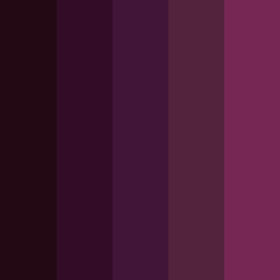
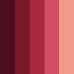
Burgundy color palettes are sophisticated schemes built around burgundy - a deep red color with purple undertones named after wine regions of France.
Unlike bright reds, burgundy has a complex, muted quality that makes it perfect for luxury design applications.
Color Family
Burgundy belongs to the red-purple family, positioned between pure red and maroon on the color wheel.
Burgundy palettes typically feature colors that complement this rich base: deep purples, wine reds, soft pinks, and neutral tones.
Key Characteristics
Burgundy color schemes are known for their depth, sophistication, and emotional richness. They pair particularly well with sage green, soft gold, or cream tones.
Versatile Applications
Burgundy color combinations can range from dramatic dark palettes perfect for gothic or luxury themes to lighter schemes like burgundy and peach combos ideal for romantic, feminine designs.
🔴 Psychology of Burgundy Color in Design
Understanding how burgundy color palettes make people feel helps you create designs that truly connect with your audience:
Luxury & Sophistication: Associated with fine wine, expensive fabrics, and luxury goods, burgundy automatically communicates premium quality and refined taste
Passion & Romance: Unlike aggressive bright reds, burgundy expresses mature, sophisticated passion.
Confidence & Authority: Dark burgundy palettes project quiet confidence and established authority
Creativity & Artistic Expression: Burgundy's complex undertones appeal to creative personalities
Comfort & Warmth: Burgundy provides emotional warmth while maintaining elegance.
🥀 Popular Burgundy Color Combinations
Burgundy pairs beautifully with purples, soft pinks, and jewel tones. Here are the most effective pairings:
Burgundy and Blue: Offers sophisticated yet welcoming appeal
Burgundy, Blue and Green: Creates a rich, natural combination
Black and Burgundy: Maximizes luxury impact
Burgundy and Gray: Sophisticated and contemporary, with gray providing neutral contrast
Turquoise and Burgundy: Creates unique, memorable combinations of complementary colors
Burgundy and Teal: Similar to turquoise but more sophisticated pairing
Burgundy and Purple: Monochromatic and deeply sophisticated schemes
Burgundy and Peach: Offers soft, romantic pairing
Burgundy and Yellow: Creates energy while maintaining sophistication
Apricot and Burgundy: Soft and romantic pairing.
🍇 Applications of Burgundy Palettes
Luxury fashion, high-end beauty, and premium accessories
Wine and hospitality: fine dining, luxury hotels, and premium beverage brands
Interior design: sophisticated residential and commercial spaces
Academic and professional services: universities, law firms, and consulting services
Creative industries like art galleries and creative agencies
Seasonal campaigns and luxury holiday marketing.
♿ Accessibility Considerations
Dark burgundy color palettes typically offer excellent contrast with light text, but always test contrast ratios using a contrast checker to meet WCAG guidelines and ensure inclusive user experiences.
Lighter burgundy schemes may require darker text for optimal readability. Consider how your chosen burgundy color combos appear to users with different visual needs.
Color Blindness Considerations
Burgundy color combinations can be challenging for users with red-green color blindness. Ensure your color schemes with burgundy don't rely solely on color to convey important information - provide additional visual cues like icons.