Pastel Color Palettes: Soft, Cute, Retro & Aesthetic Combos

Explore aesthetic pastel color palettes featuring soft, cute, candy, green, luxury, vintage and more color combinations. Use our AI-powered pastel color palette generator to create dreamy color schemes for branding, digital art, and event decor.

Pastel color palettes are pale, muted shades that bring a sense of softness, calm, and aesthetic charm to any design. These colors are perfect for light, expressive visuals and soft aesthetics.

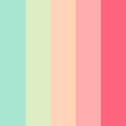
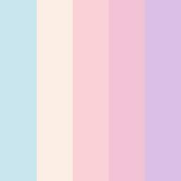
Popular pastel color combinations include:

  • Pastel rainbow - soft candy hues

  • Nature pastels - muted greens, soft yellows, earthy tones

  • Vintage pastels - dusty peach, seafoam, lavender

  • Luxury pastels - muted blush, tan, wine pastel colors

Key Characteristics of Pastel Color Palettes

  • Low saturation - Muted versions of bright colors

  • Soft and light tones - airy, calming, appealing 

  • Cute and expressive - Playful, artistic

  • Vintage / Retro appeal - Inspired by 60s-70s design trends

  • Emotional tone - Associated with comfort, innocence, romance, calm

  • Versatile in application - Like boho, luxury, minimalist.

Featured Pastel Color Palette of the Month

Florest Moth - This elegant pastel palette blends woodland greens with soft beige and rose tones. 

🎨 Colors: 

  • Woodland - #44562F

  • Asparagus - #83934D

  • Pine Glade - #B8C88D

  • Raffia - #E9DFB4

  • Desert Sand - #EFBFB3

❤️ Saved by 500+ designers this month!

Most Loved Pastel Color Palettes by Our Users

Mint Marrow - This pastel candy-like color palette with tan also features mint and blush.

  • Padua - #A8E6CF

  • Chrome White - #DDEDC4

  • Romantic - #FFD4B8

  • Cornflower Lilac - #FFADAD

  • Wild Watermelon - #FF667D

Opal Gem Elegance - This cute pastel color palette blends shades of lavender and muted gems.

  • Jagged Ice - #C9E6EE

  • Linen - #FAEEE5

  • Azalea - #FAD1D8

  • We Peep - #F2C4D6

  • Prelude - #DBC0E7

Pastel Color Palette - This candy color combo features creamy neutrals and pinks for elegant designs.

  • Kobi - #F0B2C7

  • White - #FFFFFF

  • Chablis - #FFF0F0

  • Vanilla Ice - #F0C7DB

  • Gallery - #F0F0F0

About Pastel Colors

Pastel colours are soft, light, and calm shades created by mixing white with primary colors (red, blue, and yellow) or secondary colors (green, purple, and orange). This reduces the intensity of the original color, resulting in soft and muted hues. 

These colors are perfect for creating gentle and elegant designs in branding, wellness, fashion, and emotional storytelling.

❤️ Pastel Colors from Red:

  • Pastel Red - #FF6961

  • Rose Pink - #FFB6C1

  • Light Coral - #F08080

  • Peach - #FFDAB9

  • Blush - #F9C6C9

  • Watermelon - #FF9AA2

💙 Pastel Colors from Blue:

  • Pastel Blue - #AEC6CF

  • Baby Blue - #BFEFFF

  • Powder Blue - #B0E0E6

  • Light Sky Blue - #ADD8E6

  • Periwinkle - #CCCCFF

  • Ice Blue - #D6F5FF

💛 Pastel Colors from Yellow:

  • Pastel Yellow - #FFFFB3

  • Lemon Chiffon - #FFFACD

  • Light Goldenrod - #FAFAD2

  • Cream - #FFFDD0

  • Butter - #FFF1A8

  • Flax - #EEDC82

💚 Pastel Colors from Green:

  • Pastel Green - #77DD77

  • Mint Green - #AAF0D1

  • Honeydew - #F0FFF0

  • Tea Green - #D0F0C0

  • Celadon - #ACE1AF

  • Sage - #C1DAB1

💜 Pastel Colors from Purple:

  • Pastel Purple - #CBAACB

  • Lavender - #E6E6FA

  • Mauve - #E0B0FF

  • Thistle - #D8BFD8

  • Wisteria - #C9A0DC

  • Lilac - #DCD0FF

🧡 Pastel Colors from Orange:

  • Pastel Orange - #FFD1B3

  • Apricot - #FBCEB1

  • Melon - #FFE5B4

  • Light Salmon - #FFA07A

  • Light Peach - #FFE0B2

  • Sunset Blush - #FFBCB3

Is Tan a Pastel Color?

Tan is a neutral light brown color. While it’s not a traditional pastel color, it is often used in pastel combinations. 

When tan is blended with white, it can be considered a pastel color. Pastel Tan works beautifully in soft, vintage pastel color palettes and with peach and cream tones.

Is Pastel Black a Pastel Color?

Pastel Black is not a traditional pastel. It typically refers to soft desaturated black or very dark gray. Pastel Black blends the sophistication of black with the softness of pastel tones. It provides gentle contrast in soft color palettes like lavender, blush, or pastel green.

Common Psychological Associations for Pastel Colors

  • Pastel Red  - Nurturing, romantic, tender

  • Pastel Blue - Calm, trustworthy, peaceful.

  • Pastel Yellow - Cheerful, optimistic, gentle warmth

  • Pastel Green - Fresh, soothing, balanced

  • Pastel Purple - Dreamy, creative, spiritual

  • Pastel Orange - Friendly, comforting, playful.

Where to Use Pastel Color Palettes

  • Cute and aesthetic branding

  • Retro, pastel boho, 70s-inspired designs

  • Wedding and event themes

  • Spring and Baby Shower themes

  • Design, UI and illustrations

  • Decor, fashion, stationery, and packaging.

Download Pastel Color Palette (PNG)

Download our editor’s pick - a pastel soft color palette with dreamy yellow, green, and lavender hues.

Download pastel color palette PNG image (landscape)
Download pastel color palette PNG image (square)