🌿 What Makes Brown Colors Special
Brown colors hold a unique position in design psychology - they instantly communicate stability, reliability, and natural authenticity. Brown color combinations stay relevant across decades, making them excellent choices for brands seeking longevity and trustworthiness.
Connected to Nature
Brown connects us to earth, wood, and natural materials, creating immediate psychological comfort. Natural brown color palettes tap into our innate connection to the outdoors, making viewers feel grounded and at ease.
Sophisticated and Versatile
Brown offers incredible range - from luxury brown color palettes with rich chocolates and warm cognacs to muted brown palettes with subtle, understated tones that work in any setting.
Culturally Universal
Brown carries positive meanings across different cultures, representing fertility, stability, and honest craftsmanship. This makes color palettes with brown effective for global brands and diverse audiences.
Timeless Appeal
Brown proves its design relevance across decades - from brown vintage color palettes that never go out of style to 90's brown color schemes that experience renewed popularity today.
🍂 Psychology of Brown in Design
Stability and Reliability: Suggesting established quality and enduring value
Comfort and Security: Creating psychological feelings of safety and warmth
Natural Authenticity: Triggering associations with organic materials, handcrafted goods, and sustainable practices
Quiet Elegance: Communicating refined taste and understated luxury
Grounded Confidence: Providing emotional stability without aggression
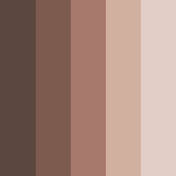
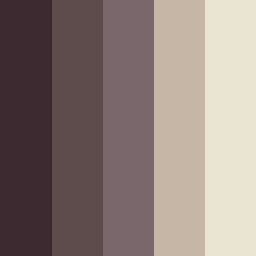
🎨 Popular Brown Color Combinations
Brown and Black: This classic combination provides elegance and authority (e.g. luxury brands and minimalist designs)
Purple and Brown: This sophisticated blend adds depth and richness to designs (e.g. creative industries and luxury wellness brands)
Green, Yellow and Brown: This earthy trio creates an organic and sustainable feel (e.g. environmental brands, outdoor companies, and artisanal products)
Rosy Brown Palettes: This is soft and feminine combination (e.g. beauty brands, boutique hotels, and lifestyle products)
Cool Brown Palettes: These sophisticated schemes balance brown's natural warmth with cooler undertones (e.g. modern architecture, approachable branding, and contemporary interior design).
🤎 Popular Applications of Brown Palettes
♿ Accessibility Considerations
Lighter browns work well for backgrounds with dark text, while darker browns can support light text for premium, sophisticated feels.
Always ensure your chosen brown palette meets WCAG guidelines for contrast ratios. Test your combination with our contrast checker to guarantee readability across all user needs and devices.
Pro tip:
Muted brown color palettes often provide better contrast ratios than bold brown combos while still maintaining sophisticated appeal.